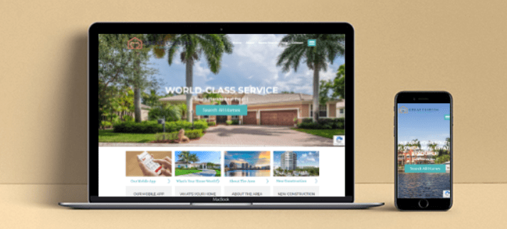
What Is Mobile-First, Responsive Web Design?
Nowadays, the majority of people who visit your website will do so on a mobile device. 40% of all users state that they conduct web searches ONLY on a mobile device. Also, over 52% of total web traffic in 2019 took place on a smart phone or tablet, and with the introduction, expansion, and inevitably widespread adoption of 5G wireless technology, that number is poised to grow even further.
This makes mobile-first, responsive web design more crucial than ever. But what exactly do we mean by mobile-first and responsive?
Mobile-First
Mobile-first means that when a web page is designed and coded, the mobile experience should be considered first, rather than the mobile web page being an afterthought. If you design your website first for the smallest screen sizes and the content is working well on those small screens, then the design and structure of your website is fundamentally sound. It should be a decent mobile website first. You can then take this baseline experience and progressively enhance it for larger screens, adding features that are nice to have on with more screen real estate, but you should make sure that the main content, features, and functionality are present and well thought out first for the mobile experience.
Responsive
Responsive means that the layout of the web page changes depending on the size of the user’s viewport. For instance, on a mobile website, it would not be wise to display all six of the links in your navigation bar horizontally at the top of the web page. You don’t want your users to have to scroll horizontally or to have to zoom in on links in order to be able to read them and click on them.
Instead, for screen sizes smaller than a certain width, only two of the links (the two which are most important) would be placed in the navigation bar, and the rest of the links would be contained within a dropdown menu than you can access by clicking “More” or the hamburger icon (the three parallel horizontal lines). Alternatively, all the links would be in the dropdown menu.
Truly responsive web design will most likely include considerations of a range of screen sizes. In the example used above, screens which are below a certain number of pixels in width (let’s say 320 pixels and below), would have the two most important links and the hamburger drop down icon.
But screens which have a width above 320 pixels and up to 360 pixels could have three links and the drop down icon in the nav bar. And screens above 360 pixels and up to 400 pixels could have four links and the hamburger icon in the nav bar. And so on and so forth.
You can see a fairly decent estimate how your website would look in various widths of screens using Google’s Chrome DevTools in the Chrome browser or the corresponding developer tools available in your browser. In Google Chrome, access the Chrome DevTools by right-clicking on the webpage and selecting “Inspect” or by pressing Control + Shift + C on Windows, Linux, and Chrome OS or Command + Option + C on a Mac.
Conclusion
By designing for the mobile experience first (and scaling up from there) and ensuring that your website is responsive and changes according to the user’s screen size, you will provide an excellent website experience for all your users, both mobile and non-mobile.